Template:RMS Monitoring Dashboards: Difference between revisions
(Created page with "==Dashboards==") |
|||
| (3 intermediate revisions by the same user not shown) | |||
| Line 1: | Line 1: | ||
==Dashboards== | ==Dashboards== | ||
Dashboards allow you to visualize collected monitoring data in an easy-to-read and visually appealing format. | |||
===Overview=== | |||
---- | |||
[[File:Monitoring dashboards1.png|border|class=tlt-border|800px]] | |||
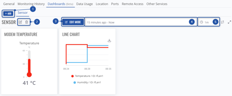
#Add a new dashboard template. | |||
#Modify currently selected template's name or remove the template completely. | |||
#Enable '''edit mode'''. Here, you'll be able to add new graphs, tables, gauges, etc., modify them, remove them from dashboards template. | |||
#Select the time frame for which the data will be displayed. | |||
#Select the frequency when the dashboard data will refreshed. | |||
===Edit mode=== | |||
---- | |||
Here, in Edit mode, you will be able to modify your selected dashboard template. | |||
[[File:Monitoring dashboards2.png|border|class=tlt-border]] | |||
#Add new dashboard widgets to the template, save any changes or cancel them. | |||
#Edit the selected dashboard or remove it from template. | |||
#Adjust the size of dashboard widget. | |||
===Adding new dashboard widget=== | |||
---- | |||
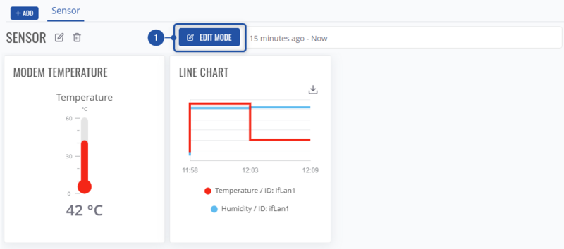
#First, enable dashboard template mode:<br>[[File:Monitoring dashboards3.png|border|class=tlt-border|800px]] | |||
#Then, press on "'''+'''" icon. | |||
#Choose widget group:<br>[[File:Monitoring dashboards4.png|border|class=tlt-border|800px]] | |||
#Let's add a new line chart - choose "'''Charts'''" widget group. | |||
#And select Line chart widget:<br>[[File:Monitoring dashboards5.png|border|class=tlt-border|800px]] | |||
#Let's configure a chart for signal strength. Choose monitoring template in which the mobile signal paramater is being monitored. The default template which monitors it - '''Dynamic monitoring''' template. And specify the parameter which you'd like to visualise, in this case - Mobile signal. <br> [[File:Monitoring dashboards6.png|border|class=tlt-border|]]<br><Br> Now, just configure the chart to your liking:<br>[[File:Monitoring dashboards7.png|border|class=tlt-border|800px]] | |||
#Type in the chart name/label. | |||
#Customize the color of chart line, change its units. | |||
#View the preview of the chart while modifying it. | |||
#Save the chart widget in order to add it into dashboard template. | |||
Revision as of 14:56, 30 October 2024
Dashboards
Dashboards allow you to visualize collected monitoring data in an easy-to-read and visually appealing format.
Overview
- Add a new dashboard template.
- Modify currently selected template's name or remove the template completely.
- Enable edit mode. Here, you'll be able to add new graphs, tables, gauges, etc., modify them, remove them from dashboards template.
- Select the time frame for which the data will be displayed.
- Select the frequency when the dashboard data will refreshed.
Edit mode
Here, in Edit mode, you will be able to modify your selected dashboard template.
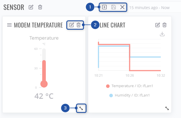
- Add new dashboard widgets to the template, save any changes or cancel them.
- Edit the selected dashboard or remove it from template.
- Adjust the size of dashboard widget.
Adding new dashboard widget
- First, enable dashboard template mode:
- Then, press on "+" icon.
- Choose widget group:
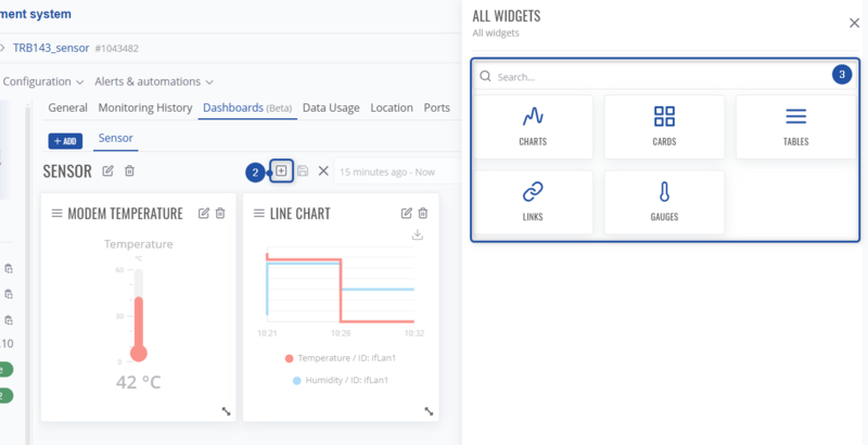
- Let's add a new line chart - choose "Charts" widget group.
- And select Line chart widget:

- Let's configure a chart for signal strength. Choose monitoring template in which the mobile signal paramater is being monitored. The default template which monitors it - Dynamic monitoring template. And specify the parameter which you'd like to visualise, in this case - Mobile signal.

Now, just configure the chart to your liking: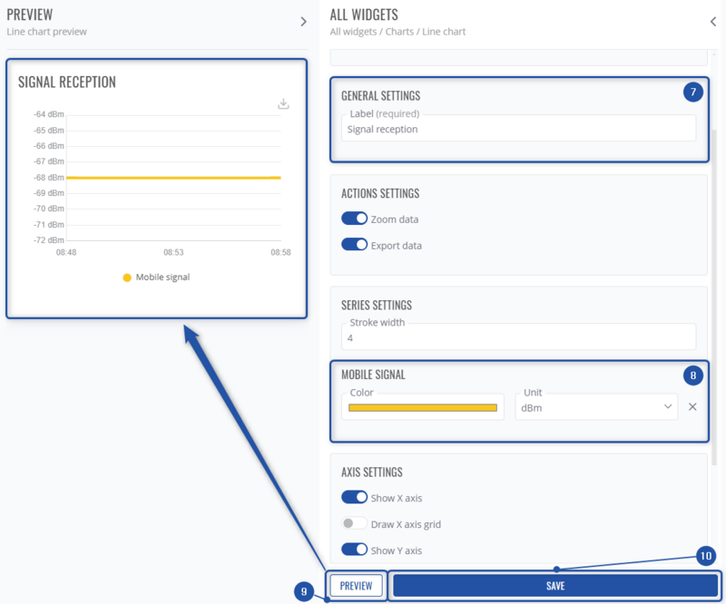
- Type in the chart name/label.
- Customize the color of chart line, change its units.
- View the preview of the chart while modifying it.
- Save the chart widget in order to add it into dashboard template.

