RUTM54 Realtime Data
The information in this page is updated in accordance with firmware version RUTM_R_00.07.20.1.
Summary
The Realtime Data page contains various graphs that display various statistical data changes in real time.
This chapter of the user manual provides an overview of the Realtime Data page for RUTM54 devices.
Load
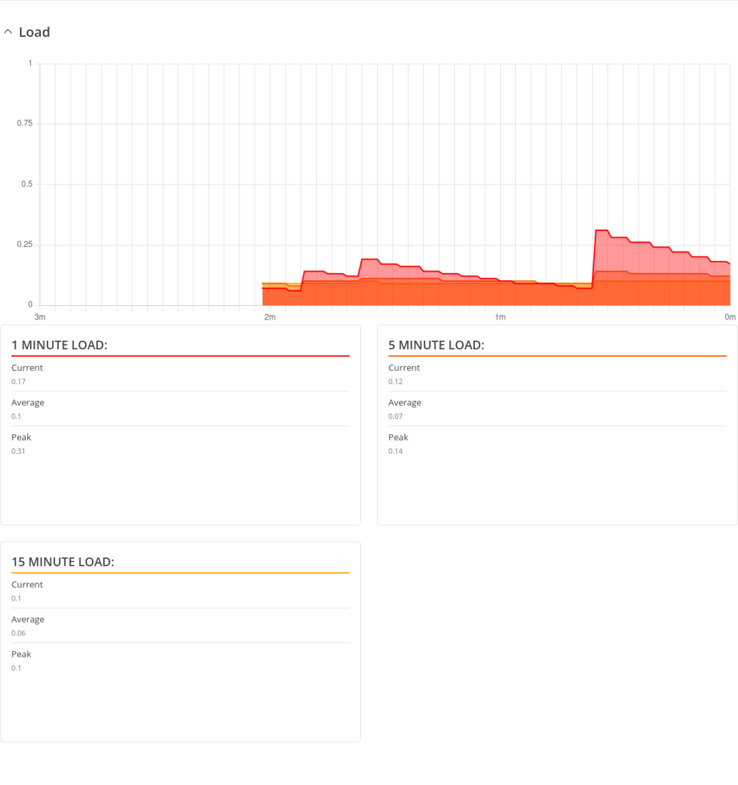
The Realtime Load section displays a tri-graph that illustrates average CPU load values in real time. The graph consists out of three color coded graphs, each one corresponding to the average CPU load over 1 (red), 5 (orange) and 15 (yellow) most recent minutes.
The figure below is an example of the Realtime Load graph:
Traffic
The Realtime Traffic graphs provide users with the possibility to monitor average inbound and outbound traffic over the course of *period. Each new measurement is taken every 3 seconds for Live data. The graphs consist out of two color coded graphs: the green graph shows the outbound traffic, the blue graph shows the inbound traffic. Although not graphed, the page also displays peak loads and averages of inbound and outbound traffic.
- Live - live traffic data usage
- Day - traffic data usage values for the current day
- Week - weekly traffic data usage values
- Month - monthly traffic data usage values
- Year - yearly traffic data usage values
- All - traffic data usage for the entire monitoring period
The figure below is an example of the Realtime traffic graph for the LAN connection:

| Graph | Description |
|---|---|
| LAN | Displays traffic that passes through the LAN network interface(s) in graph form |
| WAN, WAN6 | Displays traffic that passes through the wired WAN connection in graph form |
| Mobile | Displays traffic that passes through the mobile WAN connection in graph form |
| Wireless | Displays traffic that passes through the wifi connection in graph form |
Wireless
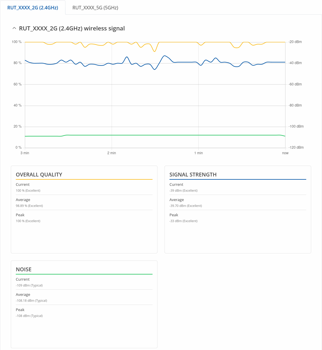
The Realtime Wireless graph displays the wireless radio signal strength (blue), signal noise (green) and overall quality (yellow).
The figure below is example of Wireless graph:
Mobile Signal
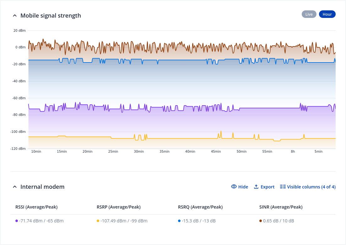
The Mobile Signal Strength graph displays cellular signal strength value changes over time.
You can navigate to different pages to display mobile signal strength values over different periods of time. This includes:
- Live - live values
- Hour - historical mobile signal strength values during 1 hour period value
To find more information on signal strength measurements, please visit the Mobile Signal Strength Recommendations page.
Mobile Usage
The Mobile Usage graph displays mobile data usage values over different periods of time.
You can navigate to different pages to display mobile data usage values over different periods of time. This includes:
- Day - data usage values for the current day
- Week - weekly data usage values
- Month - monthly data usage values
- Total - data usage for the entire monitoring period
The figure below is an example of the Day data usage graph:
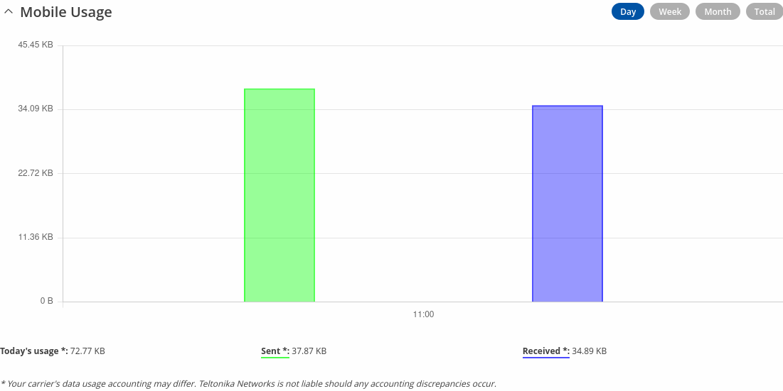
Mobile data usage graphs for other periods of time are essentially identical, with the exception that different time units are displayed at the top of the graphs.
Below the graph you can see total data usage during specific data period.
Note: your carrier's data usage accounting may differ. Teltonika is not liable should any accounting discrepancies occur.
Connections
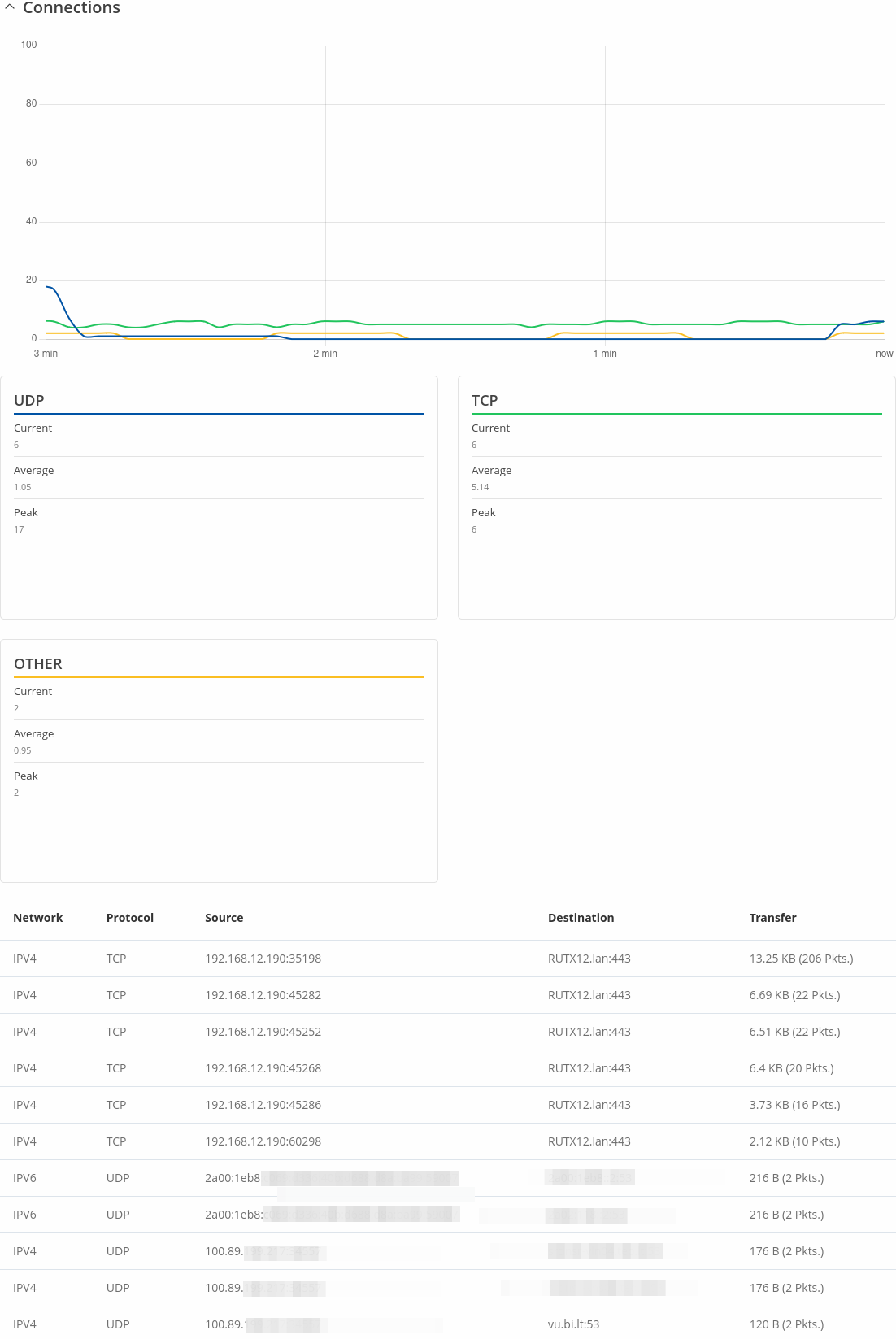
The Realtime Connections graph displays currently active network connections with the information about network, protocol, source, destination addresses and transfer speed. The table below the graph displays basic information on active connections.
The figures below are examples of both of the Realtime Connections graph and the corresponding table:
